©2026 · Services site · Brand identity
MIK Usługi
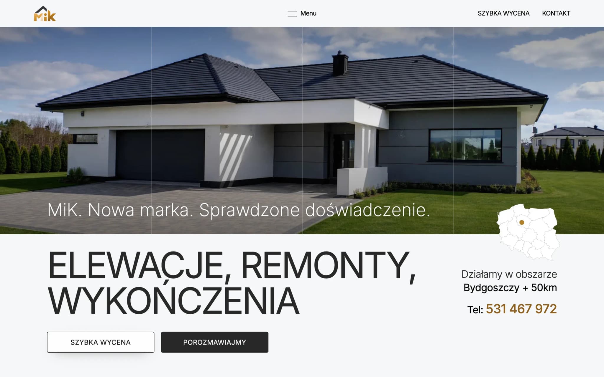
A business-card site for a renovation and finishing company moving from a sole proprietorship into a limited company.
- Client
- MIK Usługi
- Person
- Cyryl Miąskowski
- Location
- Bydgoszcz + 50 km
- Year
- 2026
- Scope
- Brand identity · One-page site · Quote calculator · Deployment
- Live
- www.mikuslugi.pl
Industry
Construction · Renovation and finishing
- Client
- MIK Usługi
- Person
- Cyryl Miąskowski
- Location
- Bydgoszcz + 50 km
- Year
- 2026
- Scope
- Brand identity · One-page site · Quote calculator · Deployment
- Live
- www.mikuslugi.pl
Challenge and approach
How do you turn a small sole proprietorship into a brand that looks like a team, not a crew from a classified ad?
- Brand identity
- One-page site
- Quote calculator
- Deployment
Challenge
For years, Cyryl ran renovations as a one-man business. He moved to a limited company, built out a team and decided to enter the market as a new brand. The problem: in construction the competition runs mostly on referrals, and an online presence usually means a Facebook gallery and a phone number.
He needed to build trust in a company that doesn't formally exist on the market yet, while carrying over its track record of completed work.
Approach
A short site with one clear guiding line: “A new brand. Proven experience.” In a single sentence the client knows the company is fresh, but that someone who knows what they're doing stands behind it.
Four clearly described services, a 4-stage process from quote to handover, and a calculator that lets the client estimate the cost themselves before they even call. The FAQ knocks down a renovation client's typical doubts before they can even put them into words.
Together it builds the image of a company that's prepared and transparent, the kind you simply want to call.
Deployment result
- 99Performance
- 100Accessibility
- 100Best Practices
- 100SEO
What I delivered.
A client who comes from a referral gets everything needed for the “I'm calling” decision in a single scroll. A one-page business-card site with six sections: a hero with a tagline, About the company (3 value pillars + the team), the Offer (4 service categories), a 4-stage collaboration process, an FAQ and a contact form.
Four service categories, interior finishing, facades, renovations, electrical installations, each with a scope list and its own “Book a quote” CTA. A renovation client most often searches for a specific service rather than a general company. The sections are optimised for that pattern.
Separate subpages: a quote calculator (/calc) as a low-friction CTA. The client estimates the cost themselves without a conversation. A work gallery (/gallery) as social proof. The legal pages (privacy policy, cookies) keep visual consistency with the rest of the site.
A contact form with name, email, phone, company and message fields, minimal friction, policy acceptance in a single checkbox. Three conversion paths: form · click-to-call phone · calculator.
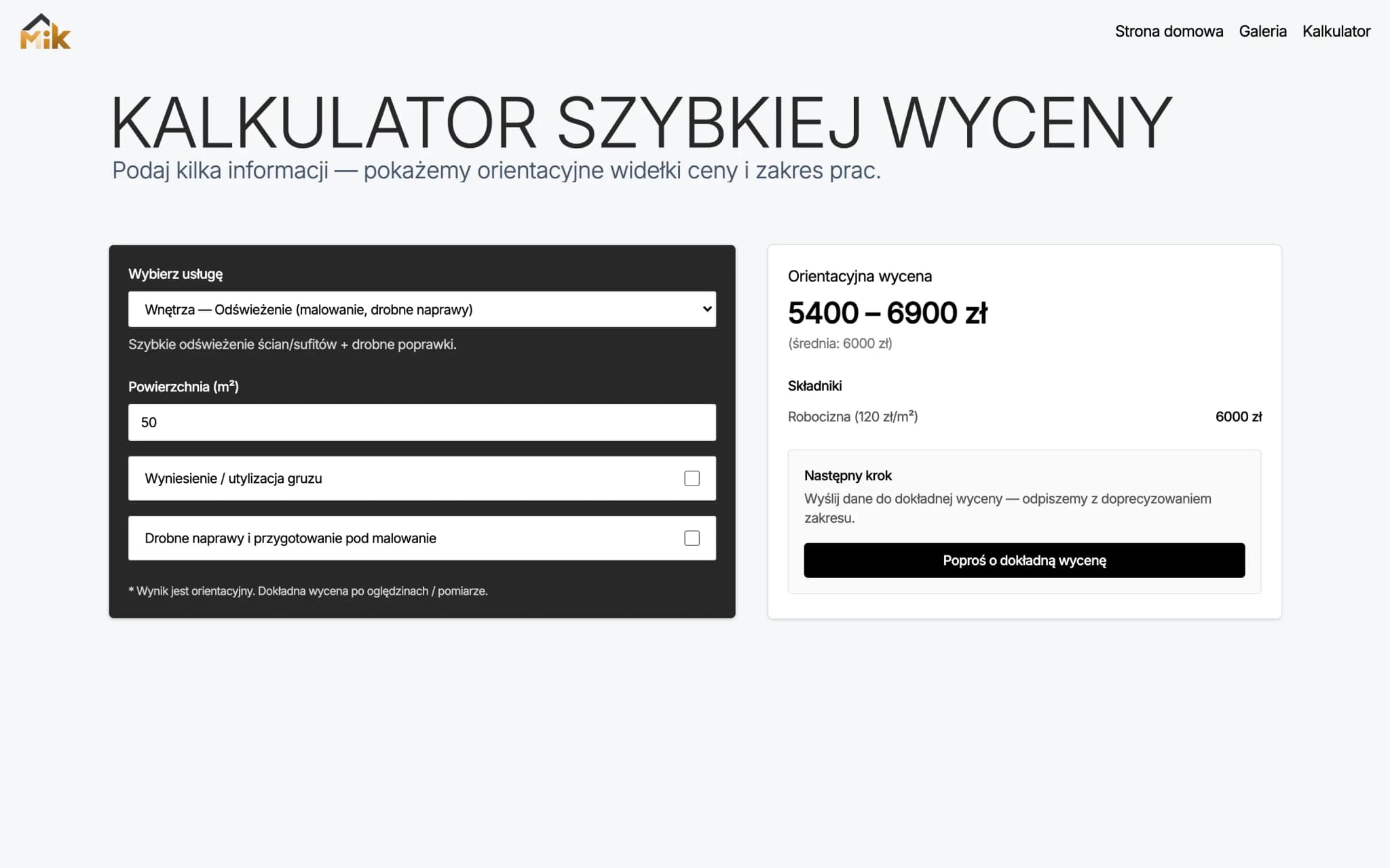
The quote calculator — the client estimates the cost before calling
How I built it.
The site loads in under a second and has nothing that can go stale: no database, no plugins, no exposure to attacks.
GSAP animations + Lenis smooth scroll in the scroll-triggered sections: fade-up on the headings, a staggered reveal of the service cards, parallax on the hero. Not showing off, subtle movements that signal “a modern team” without distracting the buyer.
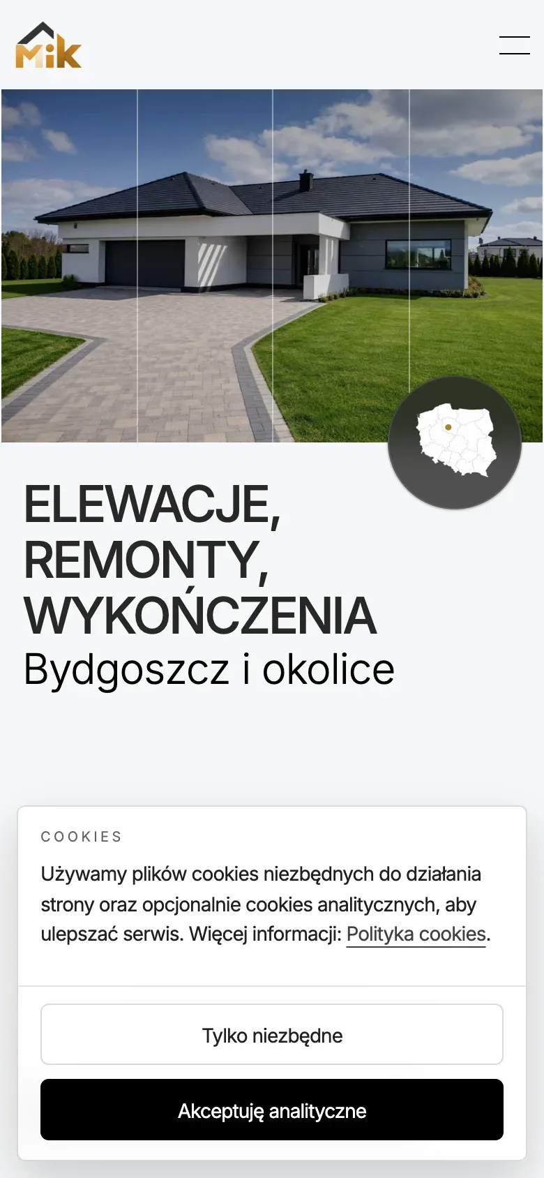
Image optimisation through Next/Image (WebP, lazy loading, responsive sizes). Mobile-first responsiveness from 360 px. Most traffic in construction is on a phone. Anchor-link navigation for the one-page UX, a form with client-side validation.
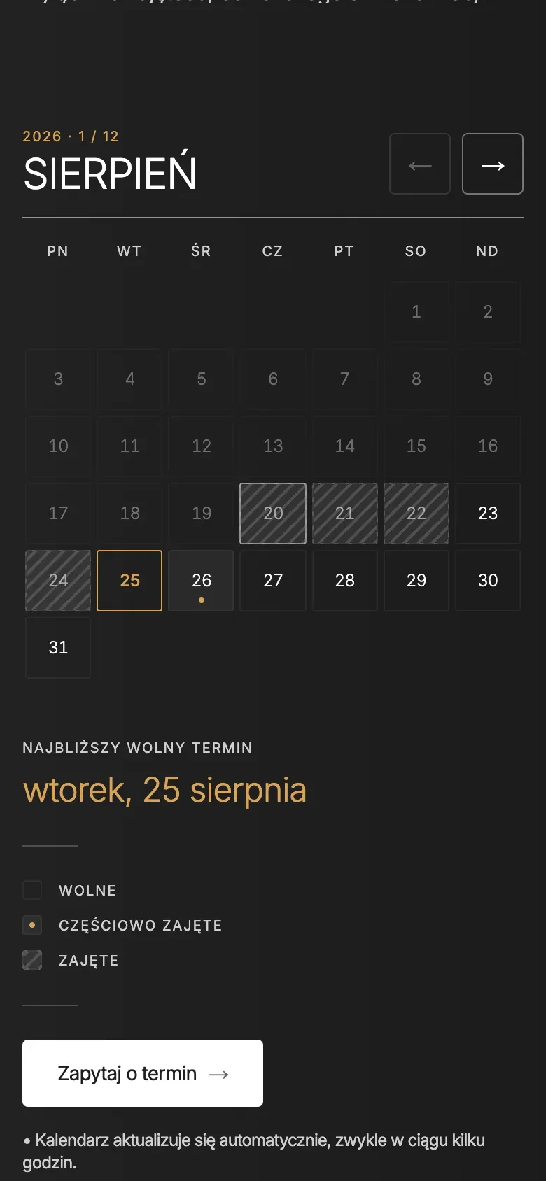
Swipe to see more
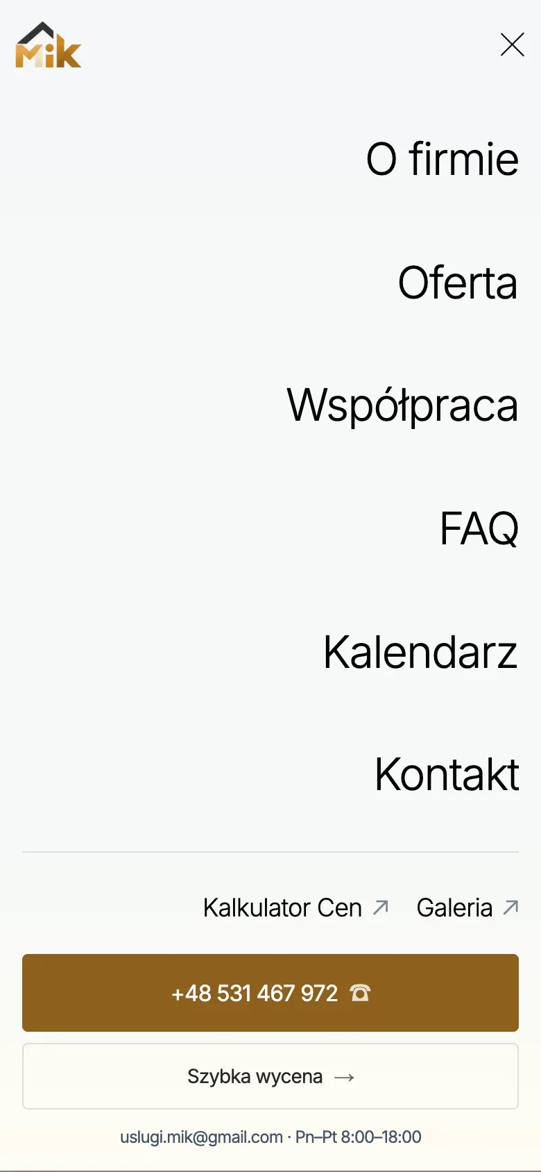
Mobile view — consent, a menu with the phone under your thumb, and the calendar from 360 px
Why this way.
One-page instead of multi-page. Most traffic in construction is a client from a referral or local Google who already has intent. They need a quick “do I call or not” decision, not a deep exploration of the offer. Everything above the fold within three scrolls.
The tagline “A new brand. Proven experience.”, a direct answer to the tension of positioning a new company: the client sees the company is fresh, but an experienced contractor stands behind it. The 4-stage process and the FAQ kill the uncertainty before the client even forms it.
Editorial typography + GSAP instead of stock interior photos. This is differentiation through design, the cheapest way to look different from 95% of renovation companies in Google results. It creates the impression of “a young, modern team”, which MIK genuinely is.
The availability calendar answers a renovation client's first question: “when can you start?”. Instead of a phone call and a promise to get back to them, they see a month grid with the booked days and the next free one. It shows availability only, never job details — that is enough for the client to judge whether the dates work.
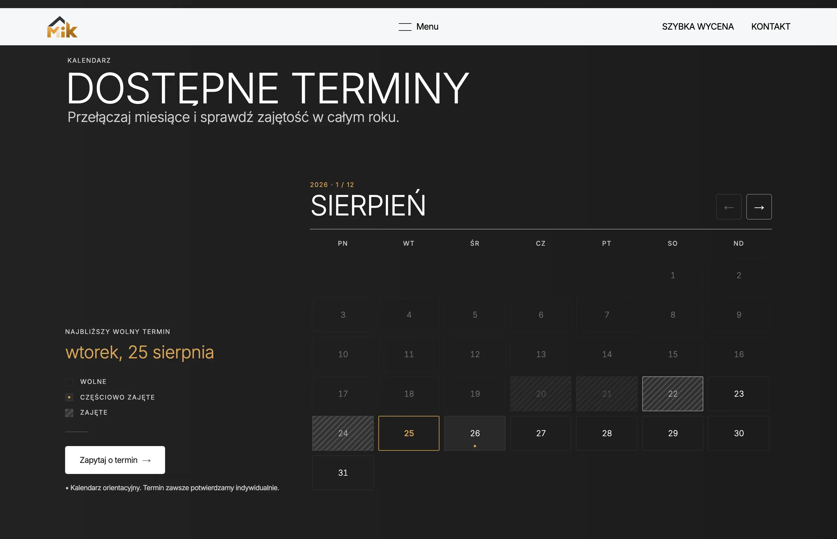
Availability calendar — the booked days in this shot are illustrative
Design system.
Granite, bone and gold. The client's logo remapped programmatically: blue letters to gold, the roof to granite. The personality comes from scale and light rather than the typeface — in a trade where competitors reach for “construction” fonts, plain legibility reads as more expensive.
MiK
- N° 01About
- N° 02Offer
- N° 03Working together
- N° 04FAQ
- N° 05Calendar
- N° 06Contact
- Granite#272727
- Bone#f6f7f8
- Gold#b47a2e
- Steel#475569
- Hero
- Facades
- H2
- Clear rules of work
- Month
- August
- Eyebrow
- Next free date
Tech stack
- Next.js
- TypeScript
- Tailwind CSS
- GSAP
- Lenis
- Vercel
Credits
- Design & code
- SoraWeb Studio · Aleksander Pietrzak
- Stack
- Next.js · TypeScript · Tailwind · GSAP · Lenis
- Hosting
- Vercel
A similar project?
Let's talk about your site.
Every site starts with a short conversation about goals. No brief, no strings attached. First I make sure we're a good fit.