©2025 · Personal brand · Design-led site
Air Dave
A site directed like a film, not a business card. Video hero, pinning in every section, horizontal scroll and overlapping cards.
- Client
- Dawid Chęsiak
- Person
- Dawid “air_d.a.v.e” Chęsiak
- Location
- Bydgoszcz and the surrounding area
- Year
- 2025
- Scope
- Personal brand identity · Design-led site · GSAP animations · Deployment
Industry
Drone photography and film · Bydgoszcz
- Client
- Dawid Chęsiak
- Person
- Dawid “air_d.a.v.e” Chęsiak
- Location
- Bydgoszcz and the surrounding area
- Year
- 2025
- Scope
- Personal brand identity · Design-led site · GSAP animations · Deployment
Challenge and approach
How do you sell a view from above to someone sitting behind a screen on the second floor?
- Personal brand identity
- Design-led site
- GSAP animations
- Deployment
Challenge
Dawid has been flying drones for over five years, as a hobby. He runs the Instagram @air_d.a.v.e and shot most of his footage for free until now, for friends and for the love of flying. Now he wants to start taking it a little more seriously and accept his first paid jobs.
Still no registered business, still as an enthusiast, but with a place on the web where a complete stranger can see him, judge the level and get in touch. Bydgoszcz has plenty of drone operators, each with a similar Instagram.
The site needed to show that Dawid is ready for his first real jobs, even though he still treats it as a passion.
Approach
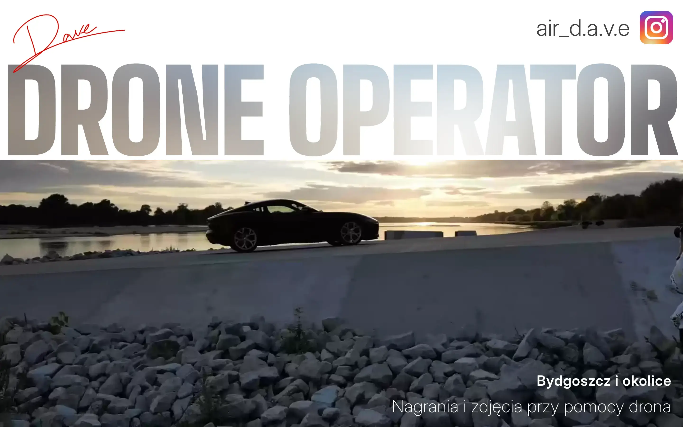
A drone is movement, so the site has to be movement too. Instead of a gallery of static photos, the moment a visitor lands they see a clip of a flight as the hero background. Each following section holds them for a beat, like a scene in a film, before moving on.
The gallery doesn't fall away in a long downward list. It slides the frames sideways. On a phone, the cards overlap one another, as if someone had spread them out on a desk. The whole site mimics the rhythm of a video edit.
Instead of reading a list of services, the visitor watches a few scenes and decides whether they want shots like these for themselves.
Deployment result
- 97Performance
- 100Accessibility
- 100Best Practices
- 100SEO
What I delivered.
Dawid got a site that does what his drone does: it leads the viewer frame by frame. One page cut like a film — six scenes, each a full screen tall, each holding the viewer for a moment before the next one slides up.
- 01A hero with a 17-second 1080p reel — the frame is there from the first second
- 02An offer broken into five services, from promo shots to video editing
- 03A gear scene with the real recording modes of a DJI Mini 3 Pro
- 04A gallery of eight frames — sideways on desktop, overlapping cards on a phone
- 05Contact with phone, email and the local time in Bydgoszcz
- 06JSON-LD Person, an og:image carrying the signature, theme-color in cinematic black
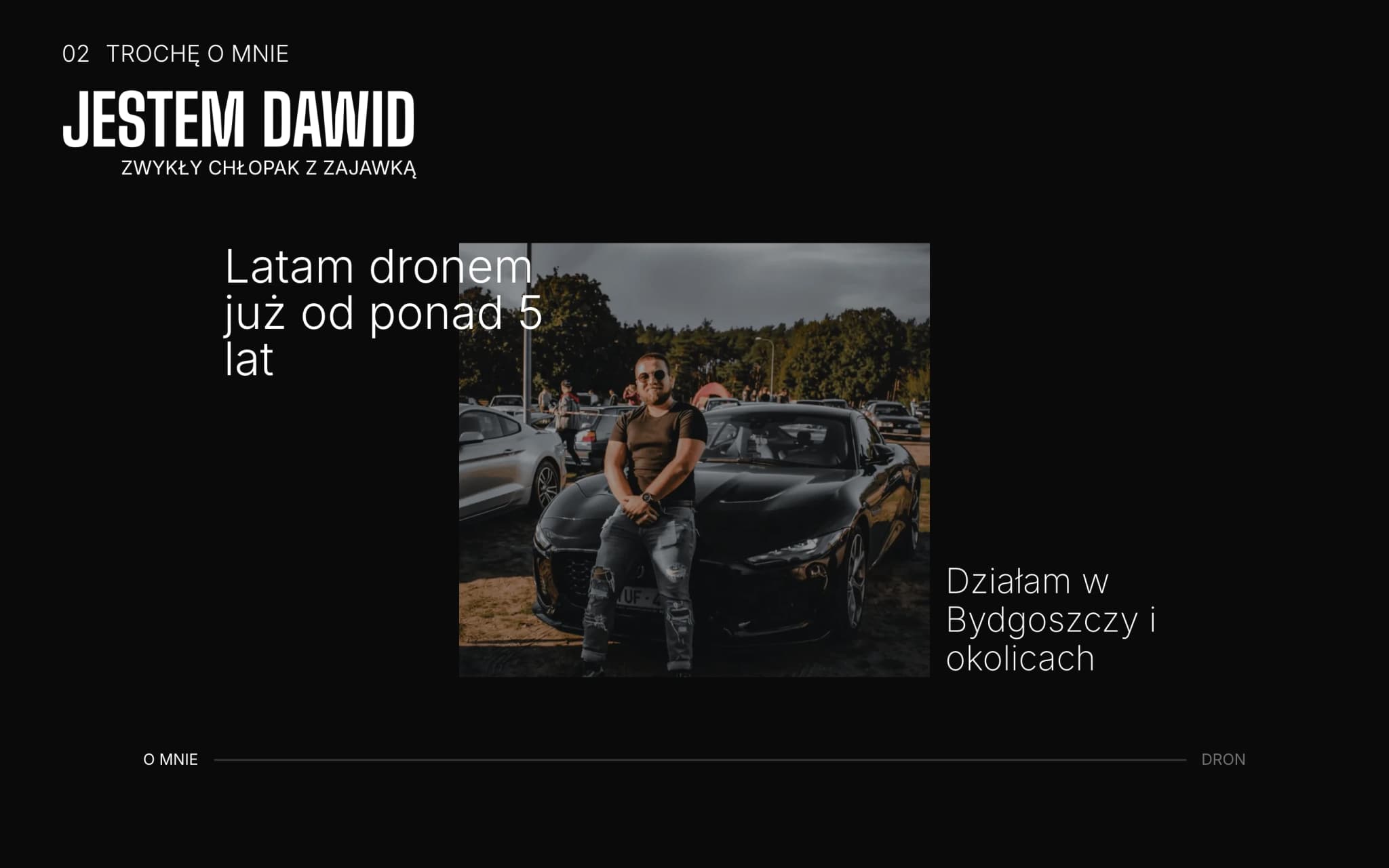
Scene 02 — “I'm Dawid”, held full-screen by a pin
How I built it.
The site comes up fast even on a weak connection, because the browser never waits for one big file. React and Vite, animation on GSAP with ScrollTrigger; the build comes out in three chunks — React separately, GSAP separately, the rest in the main file — and they all load in parallel.
The first frame is painted by a WebP poster written straight into the HTML. The video has preload set to metadata only and arrives a moment later, underneath. That is why the frame is on screen immediately, instead of holding a black background until four megabytes of footage land.
Every scene is a full screen tall with its own z-index. Scrolling doesn't move them past each other, it slides one over the next — on a phone it reads like cards being laid out on a desk. The gallery works the other way round: vertical scroll turns into horizontal movement of the frames.
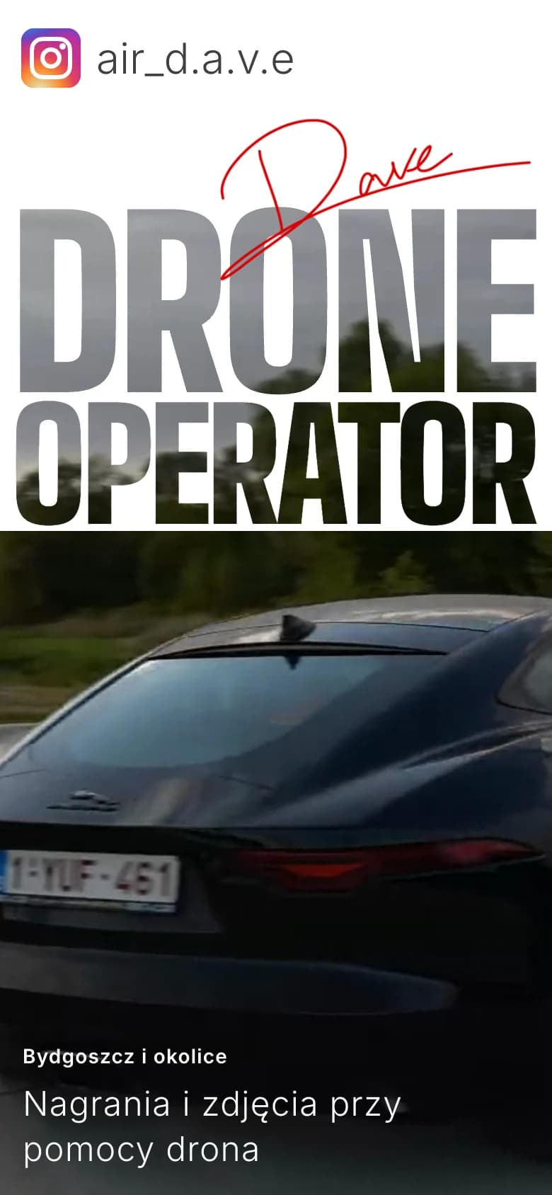


Swipe to see more
Mobile view — hero, offer and gallery, every scene from 360 px
Why this way.
A drone operator's client is buying movement: dynamics, composition, an eye for framing. That's why the hero opens with video, not an image — the very first frame sells movement before anyone reads a single sentence. A static gallery doesn't answer that question.
A pin in every section is a deliberate directorial choice. A classic scroll is a list. Pinning turns each section into a scene the viewer watches to the end before moving on. The client watches the site like a film rather than swiping it like a feed.
Horizontal scroll in the gallery and overlapping cards on mobile solve the same problem differently: instead of stretching sections across five screens, they compress the composition so every scroll delivers a new frame. You look more densely and swipe less.
React plus Vite instead of Next.js, because this isn't a catalogue of two hundred subpages for SEO, it's a single six-scene showcase. SSR and static generation would solve a problem that doesn't exist here. Vite gives a short build, a predictable split into chunks and GSAP without working around a framework.
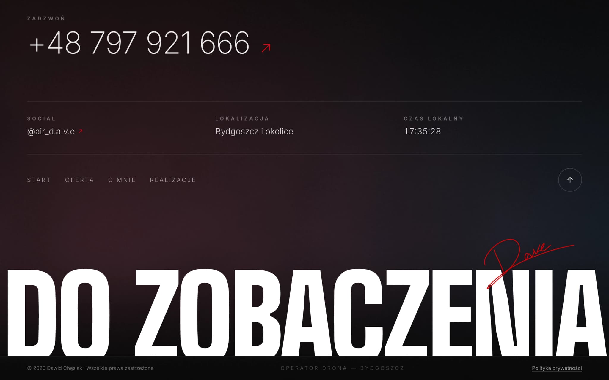
The last frame — a goodbye instead of a classic footer
Design system.
Cinematic black, a single red accent and heavy condensed bold. The type shouts and the background stays quiet, so the flight footage is the only colour on screen.
Air Dave
- N° 01This is my passion
- N° 02A bit about me
- N° 03My gear
- N° 04Contact
- Background#080808
- Text#ffffff
- Accent#e10300
- Light section#e8e8e8
- Display
- Drone Operator
- H1
- I'm Dawid
- H2
- My work
- H3
- My gear
Tech stack
- React
- Vite
- GSAP
- ScrollTrigger
- Netlify
Credits
- Design & code
- SoraWeb Studio · Aleksander Pietrzak
- Stack
- React · Vite · GSAP · ScrollTrigger
- Hosting
- Netlify
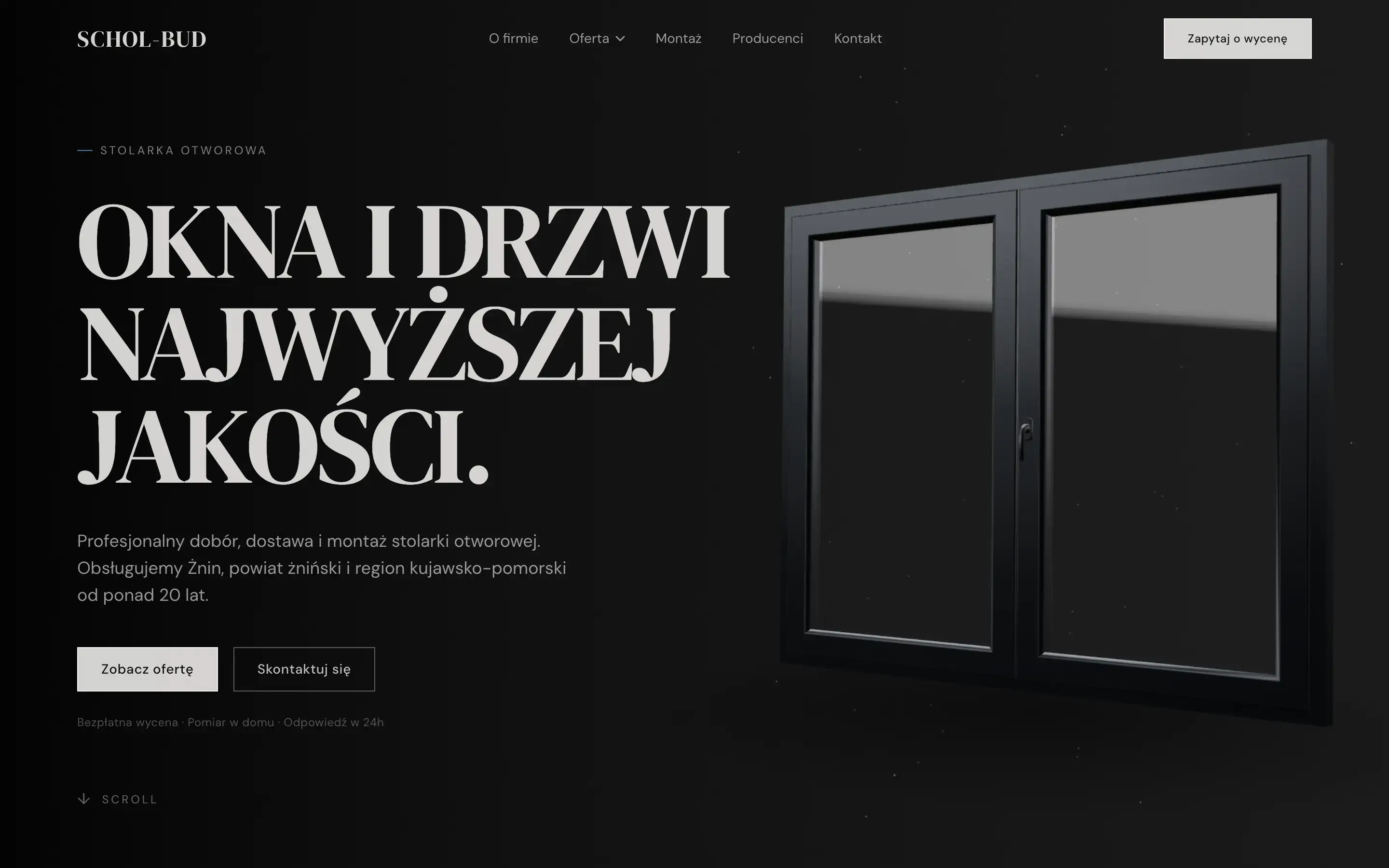
Schol-Bud
A similar project?
Let's talk about your site.
Every site starts with a short conversation about goals. No brief, no strings attached. First I make sure we're a good fit.