©2025 · Offer website · 3D product · Local SEO
Schol-Bud
Thirteen static pages for a company installing windows and doors since 2004. Three content layers, three contact paths and zero CMS to maintain.
- Client
- Schol-Bud. Producent okien i drzwi PCV
- Location
- Rynarzewo, Kuyavian-Pomeranian Voivodeship
- Year
- 2025
- Scope
- Visual identity · UX and interface design · Front-end implementation · Technical and local SEO · Performance, accessibility, security
- Live
- scholbud.pl
Industry
Windows & doors — sales and installation
- Client
- Schol-Bud. Producent okien i drzwi PCV
- Location
- Rynarzewo, Kuyavian-Pomeranian Voivodeship
- Year
- 2025
- Scope
- Visual identity · UX and interface design · Front-end implementation · Technical and local SEO · Performance, accessibility, security
- Live
- scholbud.pl
Challenge and approach
How do you sell windows to someone who collects five quotes and can't compare them? Give them numbers, a process and a company with a face — before they pick up the phone.
- Visual identity
- UX and interface design
- Front-end implementation
- Technical and local SEO
- Performance, accessibility, security
Challenge
Schol-Bud has been installing windows and doors since 2004 — PVC and aluminium windows, doors, roller shutters, garage gates — in Żnin, Rynarzewo, Bydgoszcz and the surrounding counties. A company with twenty years of experience and eight regular manufacturers had no place online that showed it.
Windows are a purchase spread over weeks. The client collects three to five quotes, compares the Uw coefficient, burglary-resistance class, acoustic insulation, lead time and warranty, and makes the decision only after an on-site measurement. A business-card website with a phone number supports none of these stages.
In local search — “windows Żnin”, “exterior doors Bydgoszcz” — chain showrooms and listing portals with ad budgets compete for every click. A small company won't win a bidding war. It can win with specifics: parameters, a described process and looking like a company rather than a template.
Approach
Instead of a one-page brochure — thirteen static pages arranged in three layers: brand (home, about), product (six categories with full specifications) and decision (installation, manufacturers, contact). The client enters at any level and always has a next step.
Three contact paths with different entry barriers: a one-thumb phone call on mobile, a three-field quote form on the home page and a full form with a project description on /kontakt. Whoever is ready to call — calls. Whoever compares at 10 p.m. — leaves a number.
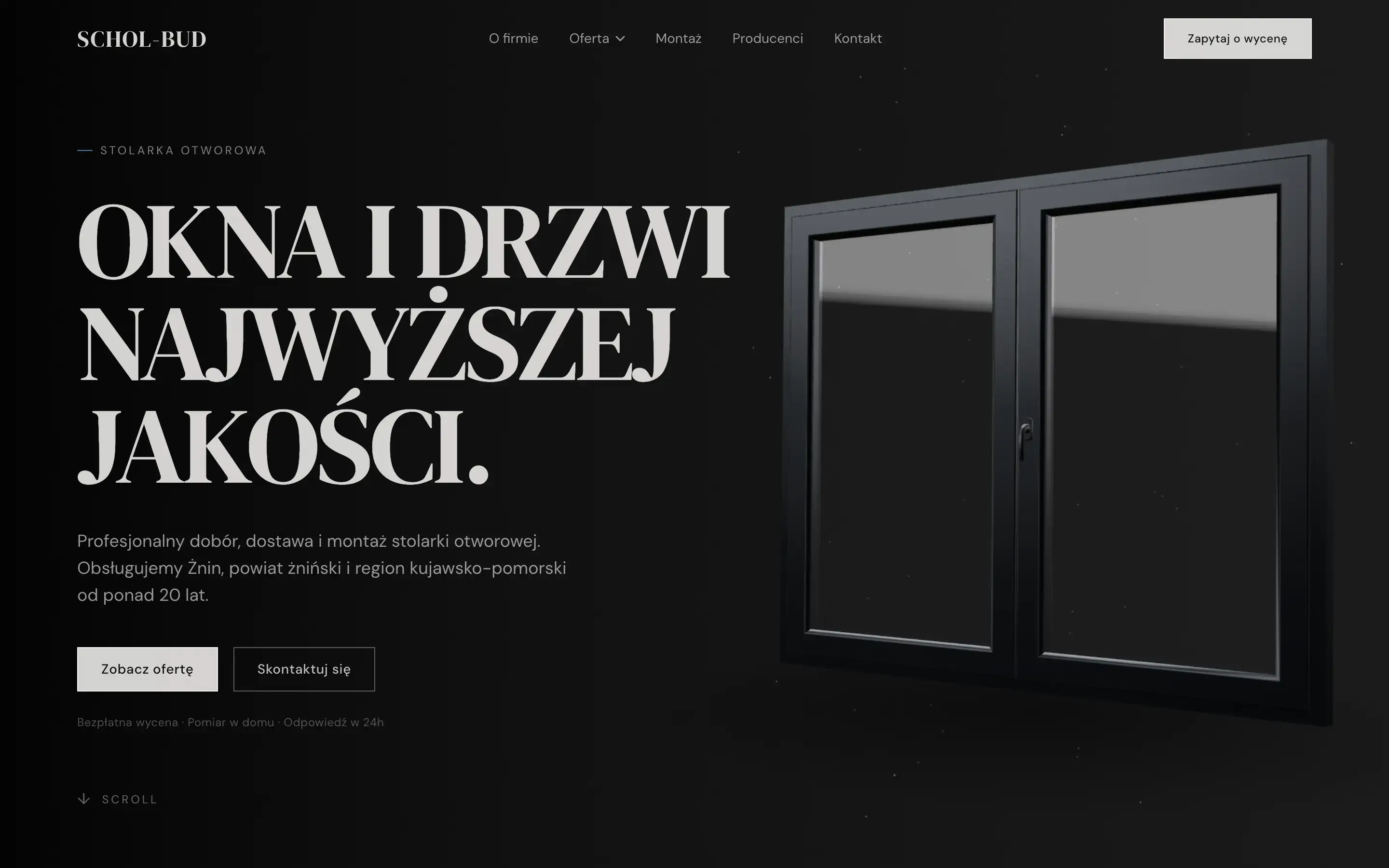
The visual layer: a dark editorial hero, the Fraunces serif in headings, a single blue accent and a 3D window model in the background. In an industry where everyone uses the same stock photos and the same gradient, design is the cheapest way to stand out in search results and link previews.
Deployment result
- 100Performance
- 100Accessibility
- 100Best Practices
- 100SEO
What I delivered.
A complete product, not a template — from visual identity to security headers and GDPR consents. Thirteen static pages in three layers of the purchase decision: brand, product, decision.
The scope was closed so that nothing was left “to add later”: the site works, measures, indexes and accepts enquiries from day one.
- 01Visual identity and design system — palette, typography, components
- 0213 static pages in three layers: brand → product → decision
- 03Six product cards with full specifications (Uw, RC class, acoustics, warranty)
- 04Three conversion paths — phone, quote form, contact form
- 05A catalogue of eight manufacturers with a category filter and PDF catalogue links
- 06Technical and local SEO — JSON-LD, sitemap, robots, OG
- 07Cookie consents, GA4 with Consent Mode v2 and a privacy policy
- 08Production audit: Lighthouse mobile and desktop, WCAG contrast, cross-browser
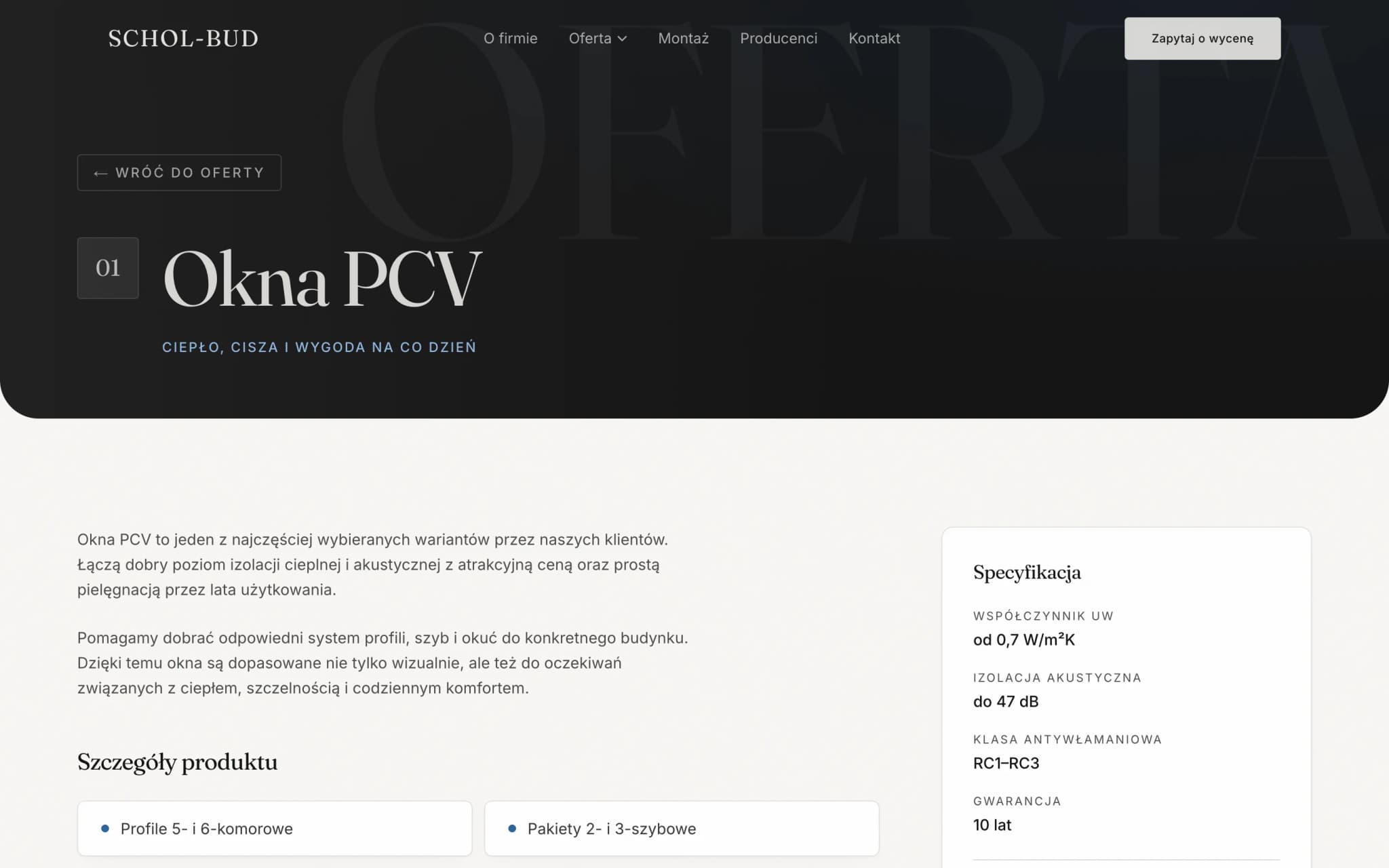
Product card — Uw, RC class, acoustics, warranty
How I did it.
The whole site is static HTML generated at build time. No database, no CMS, no plugins — content lives in seven TypeScript files, every change is a commit and an automatic redeploy. Twenty-one routes are generated statically; only two form endpoints and the Open Graph image are dynamic.
Next.js 15 with the App Router, React 19, TypeScript in strict mode, Tailwind without a component library. One motion system for the whole site: 200 ms for colours, 300 ms ease-out for link underlines and card lift. The hero entrance is animated by GSAP through gsap.matchMedia, so with prefers-reduced-motion the animation never starts.
The window model in the hero is a DRACO-compressed glTF — 7 kB of geometry rendered by React Three Fiber. The render loop stops when the section leaves the screen, so the tab doesn't burn frames in the background for the lifetime of the page.
Seventy tests in nine suites (Jest + Testing Library) cover what can realistically break: quote form validation, the manufacturer filter, the GA4 pre-consent block, navigation and content data consistency. Finally a production audit with a re-measurement after every fix.

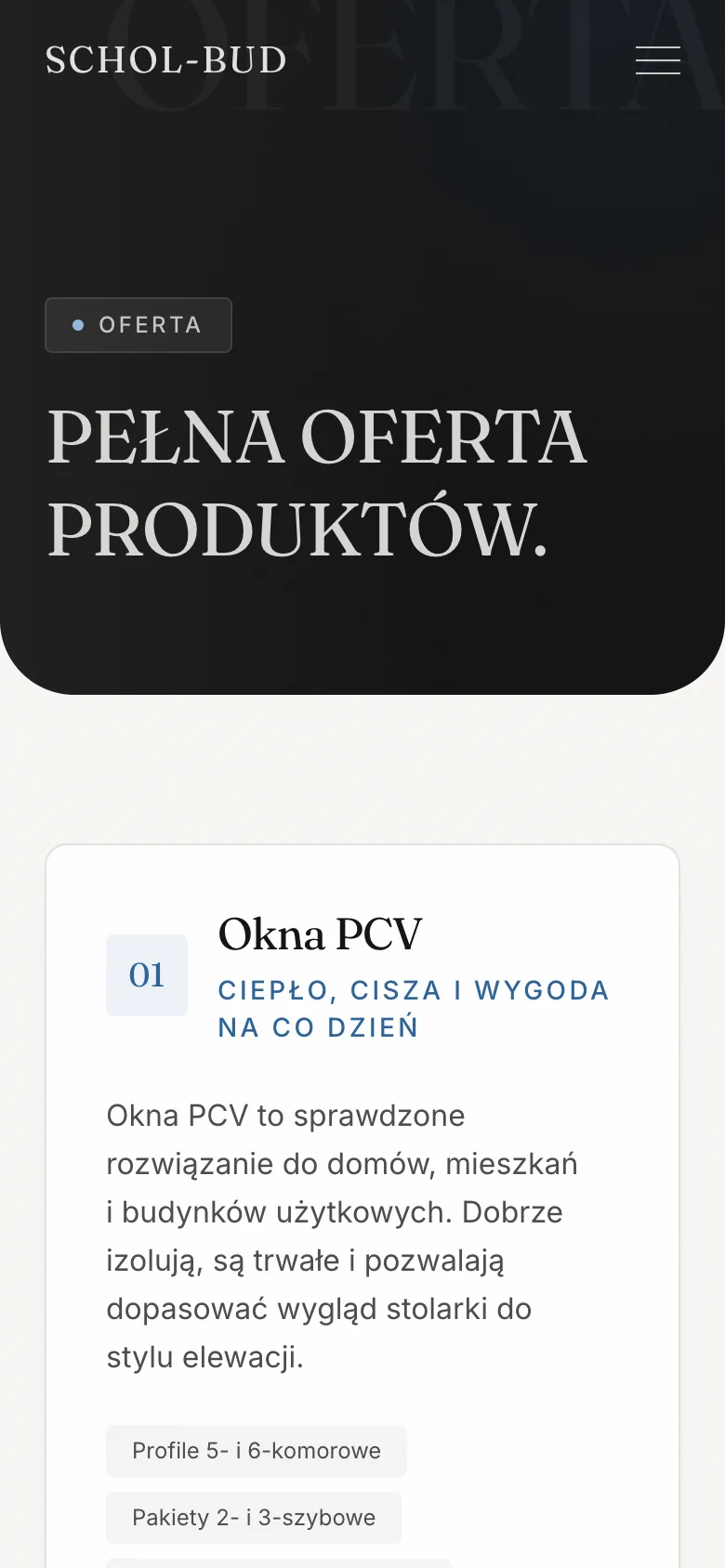

Swipe to see more
Three layers on mobile — home, offer, contact
Why this way.
Static Next.js instead of WordPress: zero plugins to update, no admin panel as an attack vector, hosting with no server or database, TTFB from a CDN. The code belongs to the client and can be moved anywhere.
The Fraunces serif with an optical-size axis instead of a corporate sans — large headings are sharper, small ones more readable. The 3D scene renders only from 1024 px up: on a phone it cost ~530 ms of TBT, and conditional rendering means the three.js chunk never downloads at all.
Technical parameters on every product card — Uw, burglary-resistance class, acoustics, warranty — are exactly the numbers the client pastes into a comparison sheet. The quote form has three fields, because every extra one lowers conversion and dimensions have to be measured on site anyway. A separate page for each of the six categories: phrases like “aluminium windows Żnin” face much weaker competition than “windows” alone.
Underneath, the layer you don't see: a honeypot and request limits on the forms, server-side validation, Content-Security-Policy with an explicit source list, HSTS with preload. GA4 downloads no script before consent — alongside it runs Vercel's cookieless analytics as a baseline.
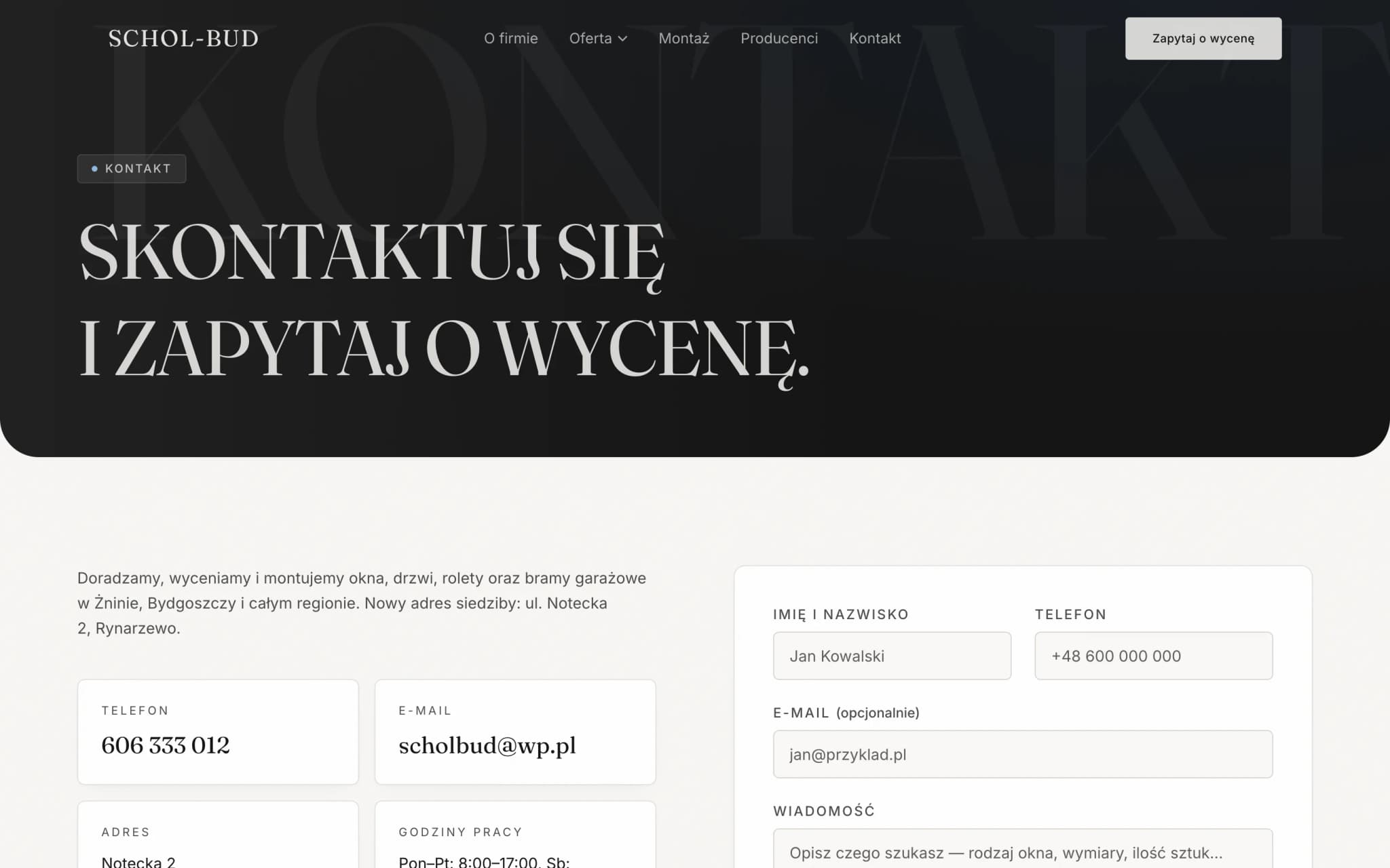
Contact — map, company details and a server-validated form
Design system.
Warm white, graphite and a single blue accent. The Fraunces serif with an optical-size axis in headings, Inter in body text — so a window company looks like a brand with character, not a wholesaler's catalogue.
SCHOL-BUD
- N° 01O firmie
- N° 02Oferta
- N° 03Montaż
- N° 04Producenci
- N° 05Kontakt
- Background#f8f7f4
- Text#111111
- Accent#2b6299
- Border#d6d6d0
- Display
- OKNA I DRZWI
- H1
- Pełna oferta produktów.
- H2
- Jak wygląda współpraca
- Lead
- Dobieramy, dostarczamy i montujemy.
Tech stack
- Next.js 15
- React 19
- TypeScript
- Tailwind CSS
- GSAP
- Three.js
- React Three Fiber
- Resend
- Jest
- Vercel
Credits
- Design & code
- SoraWeb Studio · Aleksander Pietrzak
- Stack
- Next.js · TypeScript · Tailwind · Three.js · R3F · Vercel
- Hosting
- Vercel
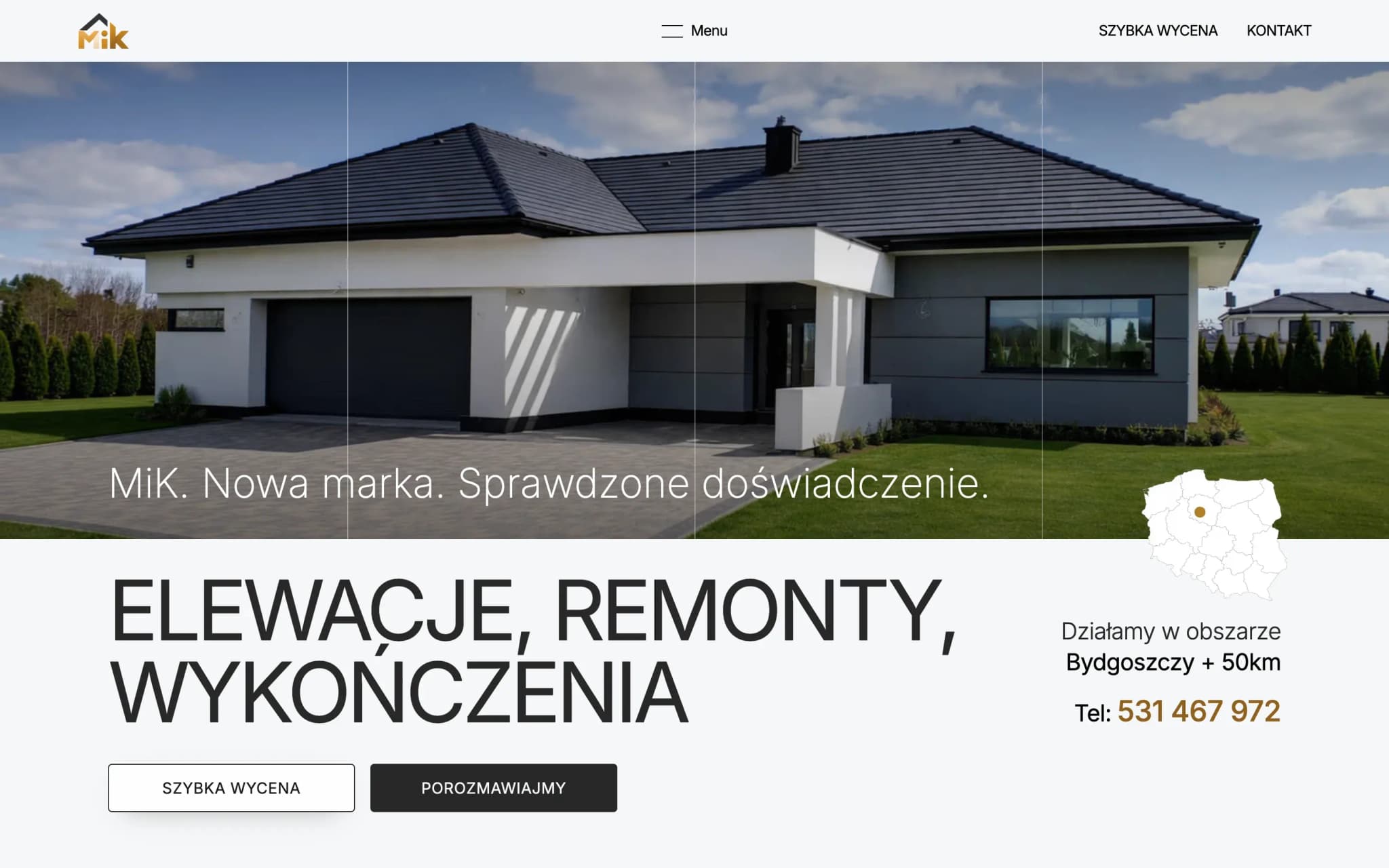
MIK Usługi
A similar project?
Let's talk about your site.
Every site starts with a short conversation about goals. No brief, no strings attached. First I make sure we're a good fit.